Chat UI Components
A common feature of user interface (UI) and development frameworks is to provide high-level building blocks so developers can reuse common functionality without having to write everything from scratch with each new application. These building blocks are called Components.
Components are ubiquitous and can be as simple as a checkbox, button, or alert dialog. Operating systems will expose components to developers, which allows all applications to ‘feel’ familiar to users on the same platform, especially when styled with a common theme such as the iOS design theme or material design.
Applications, especially web applications, are often built using an opinionated framework. These frameworks will frequently expose a common set of components to be used, for example, the React Bootstrap library or the Ionic UI component framework.
The goal of components is always the same: to make developers’ lives easier by providing out-of-the-box functionality for the most common visual and functional tasks. For example, a checkbox will show a checkmark when checked and expose an event handler for an application to register when the user checks the box.

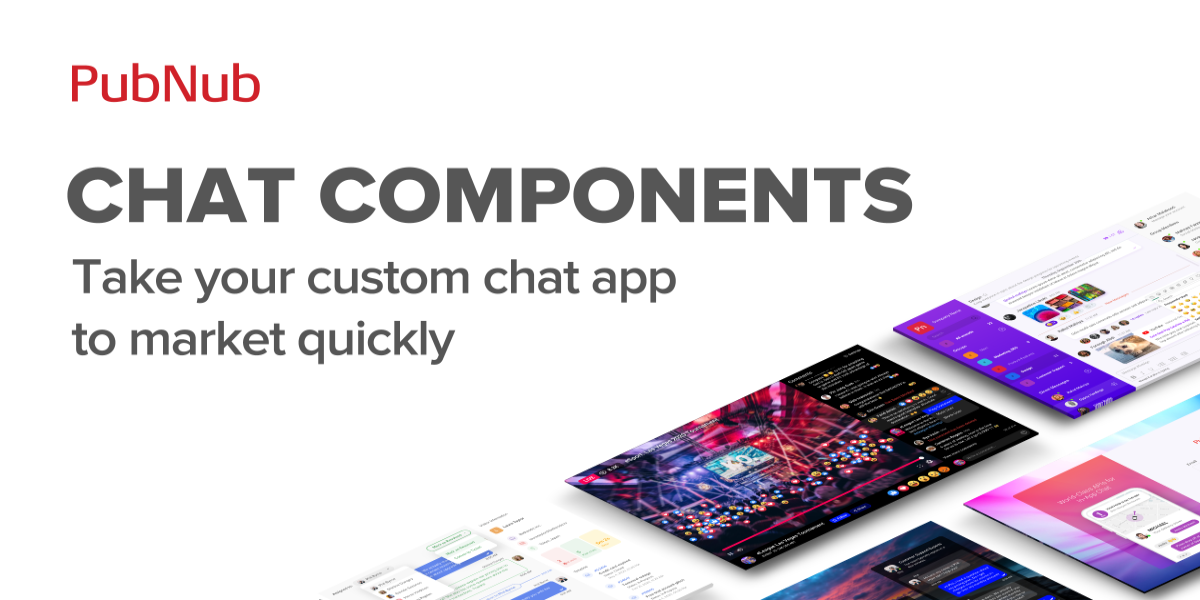
Where do PubNub Chat Components fit in?
PubNub Chat Components are no different from other component frameworks. They aim to provide flexible, opinionated, pre-built functionality and allow developers to build rapidly or prototype chat within their application.
Chat Components provide a customizable look and feel for common chat features (e.g., list of people in the chat, the message input window, the current chat, etc.). Actions can be assigned to the components, allowing them to feel like a natural extension of the app.