How to Build a Web Framework In Less Than 20 Lines Of Code
Are you tired of JavaScript framework fatigue? Should you use React or Angular or just good ole' JQuery? And what about styling? Bootstrap vs Bulma vs Materialize vs whatever popped up on Hacker News this morning?
It seems like every day there are new frameworks to learn and code to rewrite. It doesn’t have to be that way.
Frameworks aren’t as important as they were in ten years ago. Thanks to newer web standards implemented in current browsers, you can use plain CSS and JavaScript to do the magic that used to require hundreds of lines of framework code. I’m not saying we don’t need frameworks at all, but they aren’t needed as much as they used to be.
To prove it to you, today we will build our own web framework using only 20 lines of code.
Disclaimer:
This article presents the concept of a “web framework in less than 20 lines” as a minimalist exploration—not a full-featured framework. It lacks essentials like routing, state management, and a virtual DOM. Experienced developers will recognize it as a lightweight utility starter kit rather than a production-grade framework.
Good Default Fonts
Since we want to use this framework for lots of things, let’s do a quick style reset and add some good default fonts. Adobe commissioned a set of fonts called Source Pro. They have one for serif, sans-serif, and monospace. Not only are these beautiful fonts, but they contain a bunch of different weights and styles. I’m using NPM for my project so we can import them directly with
I’m using NPM for my project so we can import them directly with:
npm install --save @typopro/web-source-code-pro npm install --save @typopro/web-source-sans-pro npm install --save @typopro/web-source-serif-pro
Note that these commands will install the entire font, which is pretty big. If you are building a high traffic website you’d want to use an online font provider like TypeKit or Google Fonts.
I also like to use Font Awesome, which has an amazing collection of icon glyphs. Install it with
Install it with:
npm install --save font-awesome
To use these in the framework, create style.css with this in it:
@import "node_modules/font-awesome/css/font-awesome.css"; @import "node_modules/@typopro/web-source-sans-pro/TypoPRO-SourceSansPro.css"; @import "node_modules/@typopro/web-source-code-pro/TypoPRO-SourceCodePro.css"; @import "node_modules/@typopro/web-source-serif-pro/TypoPRO-SourceSerifPro.css"; body, button, input, select { font-family: 'TypoPRO Source Sans Pro'; font-size: 100%; line-height: 140%; } pre, code { font-family: 'TypoPRO Source Code Pro'; } This will import all of the fonts, then set body, button, input, and select to use the sans serif font, and set the pre and code blocks to use a monospace font. Setting the line height to 140% will make the text read easier.
Flexible Boxes with Flexbox
The first secret to our tiny web framework is Flexbox, a fairly recent web standard that is now implemented in pretty much every mobile and desktop browser. With Flexbox, things that used to require oodles of CSS hacks, like vertical centering, become a simple one or two line property. There are many great flexbox tutorials out there so I won’t repeat them. Instead, we’ll build a few useful utility classes out of flexbox that we can combine in different ways.
The first two classes we need are hbox and vbox. As you might guess from the name, they are a horizontal box and a vertical box. When you put content inside of the box it is laid out in a column or row. The elements will use their default size and be automatically left or top aligned. No table tricks required! You can further customize the alignment, but left/top is a good start.
.hbox, .vbox { display: flex; } .hbox { flex-direction: row; } .vbox { flex-direction: column; } To make the boxes more useful we need a way to let some element take up more space than its default. Let’s use a toolbar as an example. It is common to have a toolbar with a few buttons on the left, some content in the middle, and a few more buttons on the right. Here’s an example:
To build this layout we need the empty space in between each group of buttons to stretch and fill up the space. We can do this with a single line of CSS called ‘grow’.
.grow { flex: 1; } Now the markup for the screenshot above looks like this:
<div class="hbox"> <button>do</button> <button>stuff</button> <button>left</button> <span class="grow"></span> <b>Your CSS Framework </b> <span class="grow"></span> <button class="fa fa-cut"></button> <button class="fa fa-copy"></button> <button class="fa fa-paste"></button> </div>
This uses grow inside of an hbox, but it would work just as well inside of a vbox. It’s just flexbox underneath.
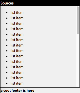
Next, let’s add a long list of things like song titles. If we just put a ul inside of a vbox then the surrounding layout will grow until it is big enough to hold the list. But suppose we had a status bar that should always be visible? The status bar would be pushed below the bottom of the screen. What we really want is for the list itself to scroll and the rest of the page to be fixed to the browser window, just like a desktop app.

To fix the layout we need two things: a way to make the outermost element take up all the browser space, and a way to make the list scroll. We can do that with just a few lines:
.scroll { overflow: auto; } .fill { position: absolute; top: 0; bottom: 0; left: 0; right:0; } The fill style makes the element be absolutely positioned and take up all available space of its container. If we set fill on the outermost div then it will fill up the body, and therefore the whole browser window. The scroll style makes an element scroll its children instead of expanding to take up the extra space.
Here’s what our markup looks like now:
<div class="vbox panel" id="sources"> <div class="header">Sources</div> <div class="scroll"> <ul> <li>list item </li> <li>list item </li> <li>list item </li> <li>list item </li> …. </div> </div>
That is the bulk of the required CSS for layout. It would be nice to do something special for forms, however.
Flexbox Forms
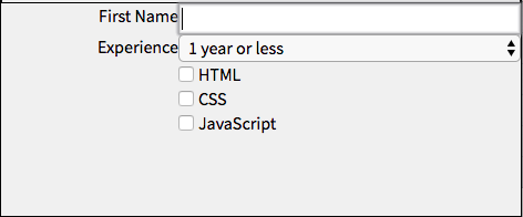
Forms are really a special case of hboxes, but with the added detail that we want labels to take up some minimum space and be right aligned. This is what it looks like:

Notice that the labels are always on the left side, except for the case of checkbox and radio buttons, where the labels are on the right. Flexbox has the amazing ability to re-order elements, so we can just add a few more rules:
/* put all inputs in the second column, except for radio & checkboxes */ input, textarea, select { order: 2; flex: 1 1 auto; } input[type="checkbox"], input[type="radio"] { order: 1; flex: none; width: auto; margin-left: 10em; } /* put all labels in the first column, unless after radio or checkboxes */ label { order: 1; width: 10em; text-align: right; } input[type="checkbox"] ~ label, input[type="radio"] ~ label { width: auto; } Javascript from Scratch
Now, let’s build our Javascript framework. We need three core features
- The ability to find an element or set of elements in the page
- The abillity to loop through elements for bulk actions
- Set event handlers
Finding elements in the DOM has always been JQuery’s strength. Doing an element query used to be a slow operation, which is why JQuery had lots of custom tweaks to make it fast enough. However, today’s browsers have a built in function to query the document for any CSS selector, called document.querySelector.
Here are a few examples:
- Find an element by ID document.querySelector(‘#someid’);
- Find an element by name: document.querySelector(‘body’);
- Find all elements with a specific class: document.querySelectorAll(‘.someclass’);
These all use the build in functions for querying selectors. Of course, JQuery provides the nice $ variable to make it quick to use. We can do the same!
function $(selector) { return document.querySelector(selector); } function $$(selector) { return document.querySelectorAll(selector); } $("#someid"); //fetch the element with the id ‘someid’ Looping and Events
JQuery and underscore and lo-dash all provide utility functions for looping through arrays, finding array items, and converting arrays with functions. This is all part of standard Javascript now. We don’t need any code at all!
Adding event handlers is also easy with modern DOM apis. We can just call addEventHandler and the name of the event. This code will print ‘hello’ every time the user clicks on any button in the page.
function printHello() { console.log("Hello!") } $$("button").forEach(button => button.addEventListener('click', printHello)); The Modern Web
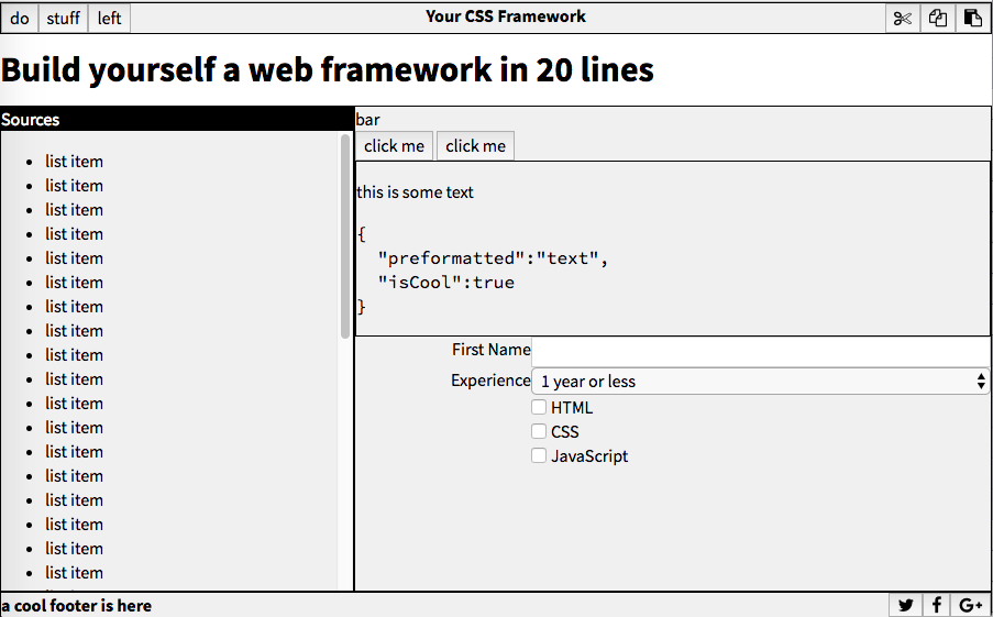
Modern Web APIs are pretty good. While Javascript frameworks can still provide value, they aren’t needed for basic web development anymore. In only twenty lines of code we built everything we need to create this app-like screen. Every panel scales and resizes exactly how you’d expect it to, as if it was made with a native toolkit. And it’s just a little bit of CSS and JS. WebTech for the win!
