User Behavior & Devices Dashboard
The User Behavior & Devices dashboard provides an overview of how users engage:
- How long users stay connected to a channel or event
- How many users stay connected, and for how long
- What device types users use to publish and subscribe
User behavior
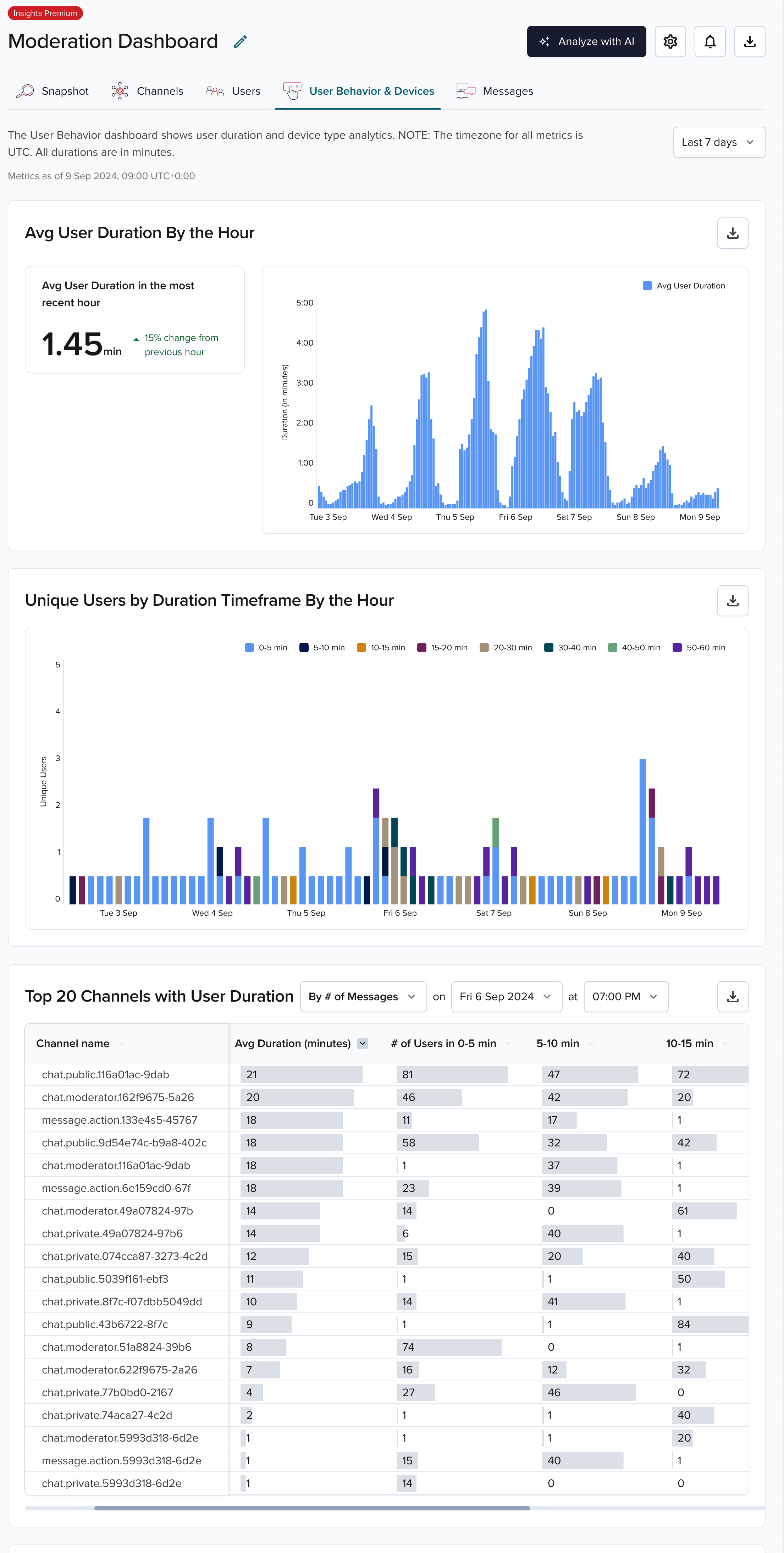
The Avg User Duration bar chart shows the average time users stay connected to a channel or event during a selected hour and date range.
The Unique Users by Duration Timeframe chart shows the number of unique users engaged in hourly buckets by timeframe (for example, 0–5 min, 15–20 min).
The Top 20 Channels with User Duration by Hour table is based on the following categories:
| Category | Description |
|---|---|
| Number of messages | Top 20 channels with the highest number of messages in the selected period. |
| Number of subscribers | Top 20 channels with the highest subscriber counts in the selected period. |
| Number of users with messages | Top 20 channels with the most users who published messages in the selected period. |
For each top channel, the table shows the average connected duration and the number of users connected for each timeframe.
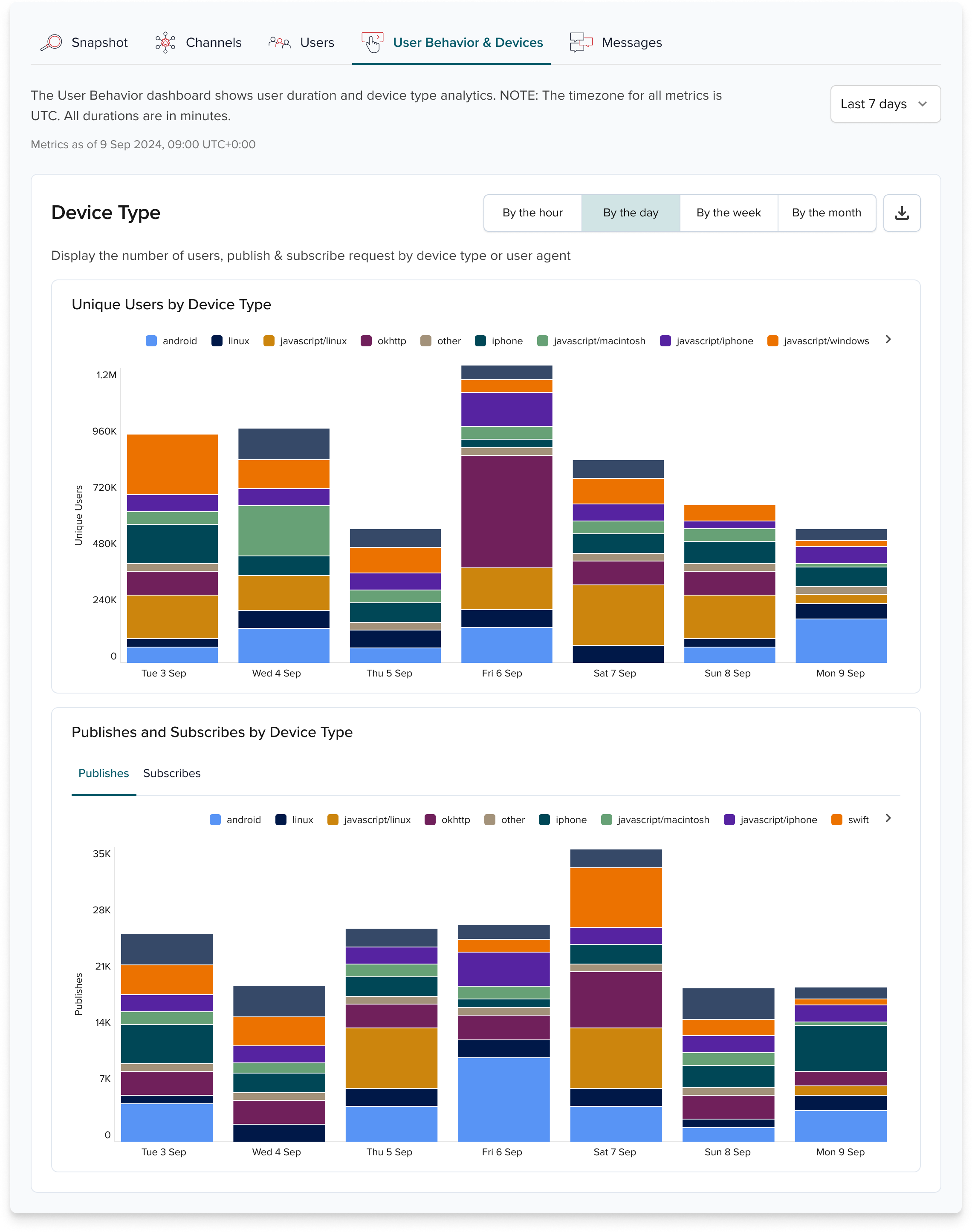
Device types
The Publishes & Subscribes by Device Type chart shows publishes or subscribes grouped by device type (for example, iOS, Android, Windows). Use this to tailor features by device.
The Unique Users by Device Type chart shows unique users grouped by device type (for example, iOS, Android, Windows).