Get started with PubNub Chat Components for Android
Unsupported library
PubNub no longer supports this software library, but you are welcome to contribute.
See how you can get a 1:1 chat app quickly up and running.
You will download a sample Android app that uses two PubNub Chat Components for Android: MessageInput and MessageList. Then, you'll run the app and send your first message by typing it in the message input field. The messages will pile up on the screen as you send them.
Prerequisites
- Android Studio (>= Dolphin 2021.3.1)
- git
Tools used
This guide uses PubNub Kotlin SDK (>= 7.3.2) for chat components and Jetpack Compose as the UI Toolkit.
Steps
Follow the steps to get your PubNub keys, clone the sample Android project files with chat components, and run the app to send your first message.
Create a PubNub account
Before you start, you need to obtain Publish and Subscribe Keys for your chat app. You need them to initialize the PubNub object in your app to send and receive messages through the PubNub Network. To get both keys, sign in or create an account on the Admin Portal. The autogenerated Demo Keyset in My First App already contains the configuration required to complete this guide.
Clone a sample chat app with components
Clone a sample app from the chat-components-android-examples repository.
1git clone git@github.com:pubnub/chat-components-android-examples.git
Configure PubNub keys
-
Once you've cloned the repository, open it in Android Studio and wait until it loads.
-
In the
gradle.propertiesfile, replace bothPUBNUB_PUBLISH_KEYandPUBNUB_SUBSCRIBE_KEYwith your Publish and Subscribe Keys from your PubNub account in the Admin Portal:1PUBNUB_PUBLISH_KEY="myPublishKey"
2PUBNUB_SUBSCRIBE_KEY="mySubscribeKey" -
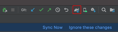
Click Sync Now or the Sync Project with Gradle Files icon in the top notification bar to update your Android project.
The rest of the configuration is already provided:
-
Dependencies to the PubNub Chat Components for Android and the Kotlin SDK are defined in the
Dependencies.ktfile:1object PubNub {
2 private const val version = "X.X.X"
3 const val bom = "com.pubnub:pubnub-kotlin-bom:$version"
4 const val kotlin = "com.pubnub:pubnub-kotlin"
5 const val memberships = "com.pubnub:pubnub-memberships"
6
7 object Components {
8 const val chat = "com.pubnub.components:chat-android:X.X.X"
9 }
10} -
The
Settingsfile stores the base application settings:1object Settings {
2 const val channelId: ChannelId = "Default"
3 const val userId: UserId = "myFirstUser"
4 val members = arrayOf("myFirstUser", "mySecondUser")
5}userId
For simplicity, the getting started app creates both the
myFirstUserandmySecondUsermembers. To switch between these two users, change theuserIdvalue. -
In the
ChatActivityfile, the app initializes the PubNub instance in theonCreate()method:1override fun onCreate(savedInstanceState: Bundle?) {
2 ...
3 initializePubNub()
4 ...
5}Similarly, the app will destroy the PubNub instance and clean up all related resources once the application is terminated:
1override fun onDestroy() {
2    destroyPubNub()
3    super.onDestroy()
4} -
To associate a sender/current user with the PubNub messages, it's required to configure the
userIdparameter (also known asuserId) to define the default value for the chat user. The app already setsuserIdin theChatActivityfile, under theinitializePubNub()method. BothpublishKeyandsubscribeKeyare copied from thegradle.propertiesfile to theBuildConfigfile when the project is built.1private fun initializePubNub(){
2 pubNub = PubNub(
3 PNConfiguration(UserId(Settings.userId)).apply {
4 publishKey = BuildConfig.PUBLISH_KEY
5 subscribeKey = BuildConfig.SUBSCRIBE_KEY
6 ...
7 }
8 )
9}
userId
For simplicity, the getting started app sets a static userId. However, if you implement chat in your app, you should generate a userId per user, device, and server and reuse it for their lifetime. Using separate User IDs in real-life apps is particularly important as it impacts your overall billing and the way your app works.
-
The app calls
ChatProviderwhich initializes all the data components. These components are responsible for providing data to UI, setting the default app theme, and communicating with the PubNub service.ChatProvideris initialized by modifying the application theme functionality, in theTheme.ktfile. This file is used to facilitate the majority of the functionality provided by PubNub Chat Components for Android.
show all 21 lines1@Composable
2fun AppTheme(
3 pubNub: PubNub,
4 database: DefaultDatabase = Database.initialize(LocalContext.current),
5 darkTheme: Boolean = isSystemInDarkTheme(),
6 content: @Composable() () -> Unit,
7) {
8 val colors = if (darkTheme) DarkColorPalette
9 else LightColorPalette
10
11 MaterialTheme(
12 colors = colors,
13 typography = Typography,
14 shapes = Shapes,
15 ) { -
The
setContent()method in theChatActivityfile calls theAppTheme()composable function responsible for setting the visual content of chat components' content on the screen:1 setContent {
2 AppTheme(pubNub = pubNub, database = ChatApplication.database) {
3 Box(modifier = Modifier.fillMaxSize()) {
4 Chat.View(Settings.channelId)
5 }
6 }
7 } -
In the
ChatApplicationfile, the app initializes the default Android Room persistence library to save data in a local database. This database is used to fill the data for all the chat components.1class ChatApplication : Application() {
2
3 companion object {
4 lateinit var database: DefaultDatabase
5 }
6
7 override fun onCreate() {
8 super.onCreate()
9 database = Database.initialize(applicationContext) { it.prepopulate() }
10 } -
The Room database needs data to display in the sample app. This data is provided in the
RoomDatabasemethod in theChatApplicationfile. This method is called only once, when the database is created.
show all 39 lines1@OptIn(DelicateCoroutinesApi::class)
2private fun prepopulateData(){
3
4 GlobalScope.launch(Dispatchers.IO) {
5 with(database) {
6 val channelArray = arrayOf(Settings.channelId)
7
8 // Creates user objects with userId
9 val members = Settings.members.map { userId ->
10 DBMember(
11 id = userId,
12 name = userId,
13 profileUrl = "https://picsum.photos/seed/${userId}/200"
14 )
15 }.toTypedArray() -
In the same
Chat.ktfile, the app invokes chat components by passing a channel-relatedChannelIdparameter to the composable function.
show all 17 lines1@Composable
2fun View(
3 channelId: ChannelId,
4) {
5 // region Content data
6 val messageViewModel: MessageViewModel = MessageViewModel.defaultWithMediator()
7 val messages = remember(channelId) { messageViewModel.getAll(channelId) }
8 // endregion
9
10 CompositionLocalProvider(
11 LocalChannel provides channelId
12 ) {
13 Content(
14 messages = messages,
15 ) -
The
Contentfunction in theChat.ktfile draws theMessageListandMessageInputcomponents in a column.
show all 31 lines1@Composable
2internal fun Content(
3 messages: Flow<PagingData<MessageUi>>,
4 presence: Presence? = null,
5 onMessageSelected: (MessageUi.Data) -> Unit = {},
6) {
7 val localFocusManager = LocalFocusManager.current
8 Column(
9 modifier = Modifier
10 .fillMaxSize()
11 .background(MaterialTheme.colors.background)
12 .pointerInput(Unit) {
13 detectTapGestures(onTap = {
14 localFocusManager.clearFocus()
15 }) -
To make sure the app works upon running, it needs internet permissions to connect to the PubNub Network. This is specified in the
AndroidManifest.xmlfile.
1<uses-permission android:name="android.permission.INTERNET" />
OkHttp version
The Kotlin SDK that PubNub Chat Components for Android are based on uses OkHttp client in version 4.9.3 to handle all HTTP requests. If your chat app uses a different version of the OkHttp client, make sure to override it in the NetworkImage.kt file as follows: val url = data.toHttpUrl().
Run the chat app
Choose an emulator and run the getting-started app.
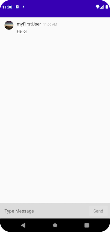
Send your first message
When your application opens up, type and send your first message. The messages will pile up on the screen as you send them.
To verify that the app is connected to the PubNub Network, mock a real-live chat conversation with myFirstUser. Open the app in a new emulator, send a message from one emulator and reply to it from another.