Message reactions (emojis) for PubNub Chat Components for Android
One emoji is sometimes worth a thousand words. Adding emojis under messages in chat apps makes your conversations way more engaging and emotional. It improves the overall user experience by adding a visual touch to it. It's particularly useful in group and social chat use cases to boost community engagement.
PubNub Chat Components for Android support emojis in conversations through the so-called message reactions. This out-of-the-box feature is available for both 1:1 and group chats and comes with six default emojis. After enabling message reactions in your application, you can customize them to your liking.
Enable reactions
Message Persistence
PubNub Chat Components for Android use PubNub's Message Reactions API to store information on added and removed message reactions. To use it in your app, make sure you have Message Persistence enabled on your app's keyset in the Admin Portal.
By default, message reactions are disabled. To enable them in your chat app, you have to add proper logic to your application code.
Check how to do that based on the Getting Started with Message Reactions app. To enable reactions, you must add a new Menu.kt file that defines the BottomMenu behavior and modify the existing Chat.kt file to update your chat application code.
Follow the steps in each file.
Menu.kt
Create a Menu.kt file under the ui.view package and define the Menu composable function.
1@Composable
2fun Menu(
3 visible: Boolean,
4 message: MessageUi.Data?,
5 onAction: (MenuAction) -> Unit,
6 onDismiss: () -> Unit,
7 modifier: Modifier = Modifier,
8) {
9 BottomMenu(
10 message = message,
11 headerContent = {
12 DefaultReactionsPickerRenderer.ReactionsPicker { reaction ->
13 message?.let { onAction(React(reaction, message)) }
14 }
15 },
BottomMenu is the drawable box that pops up when you tap the message you want to react to. It is enabled by default in the PubNub Chat Components for Android implementation and you can call it from any place in the application layout. To enable message reactions on BottomMenu, you need to pass the DefaultReactionsPickerRenderer implementation to the headerContent parameter as in the provided example.
Menu.kt
For reference, check the final version of the Menu.kt file in the Getting Started with Message Reactions app.
Chat.kt
Open the Chat.kt file and follow these steps:
-
Add the
onReactionSelectedparameter to theContentcomposable function.1 internal fun Content(
2 messages: Flow<PagingData<MessageUi>>,
3 presence: Presence? = null,
4 onMessageSelected: (MessageUi.Data) -> Unit,
5 // Add the below line
6 onReactionSelected: ((React) -> Unit)? = null,
7 ) -
Pass this new parameter to the
MessageListcomponent.1 MessageList(
2 messages = messages,
3 presence = presence,
4 onMessageSelected = onMessageSelected,
5 // Add the below line
6 onReactionSelected = onReactionSelected,
7 modifier = Modifier
8 .fillMaxSize()
9 .weight(1f, true),
10 ) -
Initialize
reactionViewModelin theViewfunction.
show all 17 lines1@Composable
2fun View(
3 channelId: ChannelId,
4) {
5 val messageViewModel: MessageViewModel = MessageViewModel.defaultWithMediator()
6 val messages = remember(channelId) { messageViewModel.getAll(channelId) }
7
8 // Add the below lines
9 val reactionViewModel: ReactionViewModel = ReactionViewModel.default()
10 DisposableEffect(channelId){
11 reactionViewModel.bind(channelId)
12 onDispose {
13 reactionViewModel.unbind()
14 }
15 } -
Add the
menuVisibleandselectedMessagestates to theViewfunction. These states are responsible for theBottomMenuvisibility and saving information on the last selected message.
show all 20 lines1@Composable
2fun View(
3 channelId: ChannelId,
4) {
5 val messageViewModel: MessageViewModel = MessageViewModel.defaultWithMediator(channelId)
6 val messages = remember { messageViewModel.getAll() }
7
8 val reactionViewModel: ReactionViewModel = ReactionViewModel.default()
9 DisposableEffect(channelId){
10 reactionViewModel.bind(channelId)
11 onDispose {
12 reactionViewModel.unbind()
13 }
14 }
15 -
Define the
onDismissmethod.
1val onDismiss: () -> Unit = { menuVisible = false}
-
Add the whole
Menucomponent underCompositionLocalProviderand define the actions for it.1Menu(
2 visible = menuVisible,
3 message = selectedMessage,
4 onDismiss = onDismiss,
5 onAction = { action ->
6 when (action) {
7 is Copy -> {
8 messageViewModel.copy(AnnotatedString(action.message.text))
9 }
10 is React -> reactionViewModel.reactionSelected(action)
11 else -> {}
12 }
13 onDismiss()
14 }
15) -
Add the additional
onMessageSelectedandonReactionSelectedparameters to theContentinvoke function underCompositionLocalProvider.1Content(
2 messages = messages,
3 // Add the "onMessageSelected" parameter
4 onMessageSelected = {
5 selectedMessage = it
6 menuVisible = true
7 },
8 // Add the "onReactionSelected" parameter
9 onReactionSelected = reactionViewModel::reactionSelected,
10)
Chat.kt
For reference, check the final version of the Chat.kt file in the Getting Started with Message Reactions app.
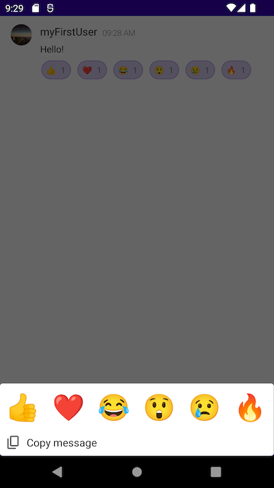
Default reactions
We provide six default message reactions to select from:

Message reactions are based on Unicode characters as surrogate pairs. Their full default list is defined in MenuDefaults.kt that's referenced in DefaultReactionsPickerRenderer.kt.
1object DefaultReactionsPickerRenderer : ReactionsRenderer {
2    ...
3    var emojis: List<Emoji> = MenuDefaults.reactions()
4    ...
5}
Check the default values in MenuDefaults.kt:
1fun reactions() = listOf(
2    UnicodeEmoji("\uD83D\uDC4D"),    // 👍 thumbs up
3    UnicodeEmoji("\u2764"),          // ❤ red heart U+2764
4    UnicodeEmoji("\uD83D\uDE02"),    // 😂 face with tears of joy U+1F602
5    UnicodeEmoji("\uD83D\uDE32"),    // 😲 astonished face U+1F632
6    UnicodeEmoji("\uD83D\uDE22"),    // 😢 crying face U+1F622
7    UnicodeEmoji("\uD83D\uDD25"),    // 🔥 fire U+1F525
8)
The UnicodeEmoji key enforces that a given emoji must be of the "reaction" type and the String value (for example, "\uD83D\uDC4D" for "thumbs up"), as defined in the Reaction.kt file.
1data class UnicodeEmoji(override val type: String, override val value: String) : Emoji() {
2    constructor(value: String) : this("reaction", value)
3}
Message Reactions API
"reaction" is a message action type that's required by PubNub's Message Reactions API that PubNub Chat Components for Android communicate with to store information on added and removed reactions.
Replace default reactions
You can override the default emojis provided by MenuDefaults.kt by defining a new set of emojis in your application code. You should run this code in your app during initialization, before calling DefaultReactionsPickerRenderer.
Check this example:
1setContent {
2    AppTheme(pubNub = pubnub) {
3        DefaultReactionsPickerRenderer.emojis = listOf(
4            UnicodeEmoji("\uD83D\uDE4A"),    // 🙊
5            UnicodeEmoji("\uD83D\uDE49"),    // 🙉
6            UnicodeEmoji("\uD83D\uDE48"),    // 🙈
7            UnicodeEmoji("\uD83D\uDC12"),    // 🐒
8            UnicodeEmoji("\uD83E\uDD8D"),    // 🦍
9            UnicodeEmoji("\uD83E\uDD84"),    // 🦄
10        )
11    }
12}
Change the default reactions count
PubNub Chat Components for Android provide six default emojis that appear in the BottomMenu row.
1object DefaultReactionsPickerRenderer : ReactionsRenderer {
2    ...
3    var visibleItemsCount: Int = 6
4    ...
5}
You can change this default number. To set it to 4, override the visibleItemsCount parameter in your application code.
1setContent {
2    AppTheme(pubNub = pubnub) {
3        DefaultReactionsPickerRenderer.visibleItemsCount = 4
4    }
5}
There is no limitation as to the total emojis count that can be shown in BottomMenu. If you provide a number larger than the default 6, the rest of the icons will be rendered under the default BottomMenu row and you can access them upon scrolling.
Limitations for negative values
The visibleItemsCount parameter is not validated for negative values so don't set it to <= 0.
Add reactions
If message reactions are enabled in your app, you can add them to a message in one of these ways:
-
Long press the chosen message and select one of the six predefined emojis from a drawer that pops up at the bottom of the screen (
BottomMenu). This way you can also remove a previously added reaction. -
Tap a reaction added by another user and the total count of reactions will increment in the reaction box under the message. This way you can also remove a previously added reaction.
Cumulative reactions
There's a counter next to every added message reaction that's incremented or decremented in real-time as users tap the emojis to either add or remove them. This list is sorted in the reaction box by the message reaction timestamp.
If the reaction counter is more than 99, it displays 99+.
This configuration is defined in the DefaultReactionsPickerRenderer.kt file.
1text = if (reaction.members.size < 100) "${reaction.members.size}" else "99+"
Reaction theme
To distinguish your reactions from those added by others, their background is highlighted in red.
DefaultReactionsPickerRenderer defines this behavior.
1val reactionTheme =
2                    if (reaction.members.any { it.id == currentUserId }) theme.selectedReaction else theme.notSelectedReaction
The choice of the appropriate theme for your and other reactions is defined in ReactionTheme.
1class ReactionTheme(
2    ...
3    selectedReaction: ButtonTheme,
4    notSelectedReaction: ButtonTheme,
5    ...
6)
Reaction size
The size of reactions in BottomMenu depends on the device width and the number of available reactions. ReactionsPicker calculates it by dividing the maximum width of the device by the total number of selected message reactions.
1itemWidth = floor(this.maxWidth.value / visibleItemsCount).dp
ReactionsPicker (in DefaultReactionsPickerRenderer.kt) sets the 1:1 ratio for the message reactions, so if you set one item (icon) in a row, this item will be a square with a width equal to the device width.
Communication with PubNub
Message reactions interact with the MessageList component. The logic that defines what is happening upon long-tapping a message is invoked in MessageRenderer through these four methods in the Message composable function.
1interface MessageRenderer {
2    @Composable
3    fun Message(
4        ...
5        reactions: List<ReactionUi>,
6        onMessageSelected: (() -> Unit)?,
7        onReactionSelected: ((Reaction) -> Unit)?,
8        reactionsPickerRenderer: ReactionsRenderer,
9    )
10    ...
11}
- reactions stands for the list of reactions to a specific message.
- onMessageSelected opens up
BottomMenuwith available reactions to pick when you long-tap a message. - onReactionSelected stands for the action that's to be called when you choose a reaction.
- reactionsPickerRenderer is the default renderer that defines how the selected message reaction is displayed.
Long-tapping a message and choosing a reaction triggers reactionViewModel which acts as an intermediary between the UI layer, services, and repositories. reactionViewModel uses messageActionRepository to retrieve information on the selected reaction from the local Room database to verify who, when, and where (on which channel) selected a given reaction.
1fun reactionSelected(reaction: PickedReaction) {
2    viewModelScope.launch {
3        val storedReaction = messageActionRepository.get(
4            userId,
5            react.message.channel,
6            react.message.timetoken,
7            react.reaction.type,
8            react.reaction.value,
9        )
10    ...
11    }
If such a reaction, like thumbs up, hasn't been previously selected by this user and is not present in the local database, it needs to be added. messageReactionService calls actionService to add the given action entry to the PubNub Message Persistence.
1    override suspend fun add(
2        channel: ChannelId,
3        messageTimetoken: Long,
4        type: String,
5        value: String,
6    ) {
7        logger.i("Add message action '$type:$value' on channel '$channel'")
8        try {
9            val result = actionService.add(channel, PNMessageAction(type, value, messageTimetoken))
10                .toResult(channel)
11            addAction(result)
12        } catch (e: Exception) {
13            logger.e(e, "Cannot add message action")
14        }
15    }
If the action entry gets stored in PubNub successfully, messageReactionService saves this action information in the local repository.
1private suspend fun addAction(result: PNMessageActionResult) {
2    messageActionRepository.insertOrUpdate(mapper.map(result))
3}
The local database holds these details about each message reaction, where published stands for the time when the message action was added (check DBMessageAction.kt for details).
1data class DBMessageAction(
2    override val channel: ChannelId,
3    override val user: UserId,
4    override val messageTimestamp: Timetoken,
5    override val published: Timetoken,
6    override val type: String,
7    override val value: String,
8    ...
9)