Message menu for PubNub Chat Components for Android
MessageMenu allows you to perform actions on sent messages by long-tapping them. It allows you, for example, to copy a message to the clipboard.
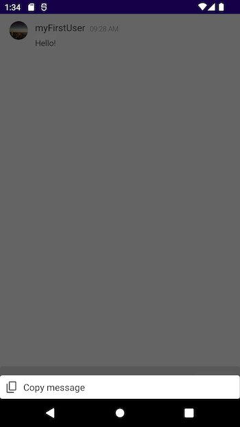
MessageMenu uses the concept of Bottom Sheets from Material Design. By default, the Copy message option in MessageMenu is enabled, but you can easily disable or override it. MessageMenu appears on BottomMenu which pops up when you long-tap a message. A single message option available on MessageMenu consists of an icon and a text field that provides the name of the option.
BottomMenu
MessageMenu is defined in PubNub Chat Components for Android as part of the BottomMenu composable function:
1@Composable
2fun BottomMenu(
3    message: MessageUi.Data?,
4    onAction: (MenuAction) -> Unit,
5    onDismiss: () -> Unit,
6    modifier: Modifier = Modifier,
7    visible: Boolean = true,
8    states: List<MenuItemState> = message?.let { MenuDefaults.items(message) } ?: emptyList(),
9    headerContent: @Composable ColumnScope.() -> Unit = {},
10    bodyContent: @Composable ColumnScope.() -> Unit = {
11        MessageMenu(items = states, onClick = { onAction(it) })
12    },
13)
| Parameter | Description |
|---|---|
message | Reference to the selected message, needed for all action types |
onAction | Global onClick handler with MenuAction passed |
onDismiss | Action to call after closing or clicking outside of MessageMenu |
modifier | Way in which MessageMenu is drawn |
visible | Visibility state |
states | List of menu items |
headerContent | Rendering function for the header, empty by default, used for drawing message reactions |
bodyContent | Rendering function for the body, used for MessageMenu by default |
BottomMenu describes the bottom drawer that pops up on the screen when you long-tap a sent message. The layout of BottomMenu itself is split into headerContent and bodyContent, both of which are modifiable. By default, headerContent is empty and must be used to pass message reactions while bodyContent contains the MessageMenu component which specifies options available in BottomMenu:
1@Composable
2fun MessageMenu(
3    items: List<MenuItemState>,
4    onClick: (MenuAction) -> Unit,
5    modifier: Modifier = Modifier,
6    content: @Composable ColumnScope.(MenuItemState) -> Unit = { state ->
7        MenuItem(
8            state = state,
9            onClick = onClick,
10        )
11    }
12)
Check out a sample usage:
1@Composable
2fun MessageMenuExample() {
3 val items = listOf(
4 MenuItemState(
5 title = R.string.menu_copy,
6 iconPainter = rememberVectorPainter(image = Icons.Rounded.ContentCopy),
7 action = Copy(dummyMessageData()),
8 ),
9 MenuItemState(
10 title = R.string.menu_delete,
11 iconPainter = rememberVectorPainter(image = Icons.Rounded.Delete),
12 action = Delete(dummyMessageData()),
13 ),
14 )
15 MenuItemTheme(DefaultMenuItemTheme) {
The MessageMenu composable function consists of:
Items
items stands for the list of menu items referred to in the MenuItemState class. This call contains a string resource reference to the title of the menu option, iconPainter for drawing an icon (you can use either local or remote files), and the type of action on which the option is triggered (set to onClick by default).
1data class MenuItemState(
2    @StringRes val title: Int,
3    val iconPainter: Painter,
4    val action: MenuAction,
5)
Default values for those parameters are stored in MenuDefaults that contains both the default MessageMenu options and message reactions:
1object MenuDefaults {
2    @Composable
3    fun items(message: MessageUi.Data) = listOf(
4        MenuItemState(
5            title = R.string.menu_copy,
6            iconPainter = rememberVectorPainter(image = Icons.Rounded.ContentCopy),
7            action = Copy(message),
8        ),
9    )
onClick
onClick stands for the callback handler for selecting an action. It calls MenuAction which is a sealed class for defining multiple actions.
1sealed class MenuAction(val message: MessageUi.Data)
2

3class Copy(message: MessageUi.Data) : MenuAction(message)
Modifier
modifier is an obligatory Compose parameter that defines how the component is drawn. We can use it to define the animation for BottomMenu, its position, or its size.
Content
content is a composable function used for rendering a single item (MenuItem).
Check out a sample usage:
1@Composable
2fun MenuItemExample() {
3    val message: MessageUi.Data = dummyMessageData()
4    MenuItemTheme(DefaultMenuItemTheme) {
5        MenuItem(
6            MenuItemState(
7                title = R.string.menu_copy,
8                iconPainter = rememberVectorPainter(image = Icons.Rounded.ContentCopy),
9                action = Copy(message),
10            )
11        )
12    }
13}
Disable message options
MessageMenu with the Copy message option is enabled by default. To disable it, replace the bodyContent parameter with an empty function:
1BottomMenu(
2  onAction = { action ->
3    onAction(action)
4  },
5  onDismiss = onDismiss,
6  visible = visible && message != null,
7  modifier = modifier,
8  // Add the below line
9  bodyContent = {},
10)
Override message options
You can define your own message options to be displayed in MessageMenu or replace the existing option with a different one. To add additional options:
-
Define a new
MessageMenuoption, such asDelete:1val menuItems = listOf(
2 MenuItemState(
3 title = R.string.menu_copy,
4 iconPainter = rememberVectorPainter(image = Icons.Rounded.ContentCopy),
5 action = Copy(message),
6 ),
7 MenuItemState(
8 title = R.string.menu_delete,
9 iconPainter = rememberVectorPainter(image = Icons.Rounded.Delete),
10 action = Delete(message),
11 )
12) -
Pass
menuItemsin thestatesparameter toBottomMenuin your app code:1BottomMenu(
2 …
3 states = menuItems,
4 …
5) -
Consume the new option by overriding the
onActionparameter and adding the additionalDeleteclass:1onAction = { action ->
2 when (action) {
3 is Copy -> {
4 action.message.text?.let { content ->
5 messageViewModel.copy(AnnotatedString(content))
6 }
7 }
8 is Delete -> handleDelete(action.customData, action.message)
9 is React -> reactionViewModel.reactionSelected(action)
10 else -> {}
11 }
12}
Theming
As already mentioned, a single MessageMenu option (like Copy message) is defined by the MenuItem composable function that applies the theming outlined in MenuItemTheme.
1class MenuItemTheme(
2    modifier: Modifier = Modifier,
3    text: TextTheme,
4    icon: IconTheme,
5    horizontalArrangement: Arrangement.Horizontal,
6    verticalAlignment: Alignment.Vertical,
7)
Its default implementation looks as follows:
1@Composable
2fun MenuItem(
3 state: MenuItemState,
4 onClick: ((MenuAction) -> Unit)? = null,
5 theme: MenuItemTheme = LocalMenuItemTheme.current,
6) {
7 Row(
8 modifier = Modifier
9 .clickable(
10 onClick = { onClick?.invoke(state.action) },
11 interactionSource = remember { MutableInteractionSource() },
12 indication = rememberRipple(),
13 )
14 .then(theme.modifier),
15 horizontalArrangement = theme.horizontalArrangement,
Customize parameters
MenuItemTheme allows you to customize these parameters for MessageMenu:
- Background color of the whole list and a single option
- Text color of an option title
- Icon tint
Background color of the list
To change the background color of the whole option list to a different one, pass the modifier parameter with a selected background color like Red:
1BottomMenu(
2  onAction = { action ->
3    onAction(action)
4    onDismiss()
5  },
6  onDismiss = onDismiss,
7  visible = visible && message != null,
8  // Add the below line
9  modifier = Modifier.background(Color.Red),
10  ...
11)
Since in the default implementation there's no padding set to modifier, add extra padding to show the difference better:
1modifier = Modifier
2                    .background(Color.Red)
3                    .padding(12.dp),
Background color of an option
To change the background color of a single option, override the background parameter to a selected color like DarkGray:
1val theme = ThemeDefaults.menuItem(modifier = Modifier.fillMaxWidth().background(Color.DarkGray))
2MenuItemTheme(theme) {
3    BottomMenu(...)
4}
Color of the option title
To change the color of an option title to a different one, override the menuItemTitle parameter to a selected color like Red:
1val theme = ThemeDefaults.menuItem(text = TextThemeDefaults.menuItemTitle(color = Color.Red))
2MenuItemTheme(theme) {
3    BottomMenu(...)
4}
Icon tint
To change the color tint of an icon to a different one, override the menuIcon parameter to a selected color like Red:
1val theme = ThemeDefaults.menuItem(icon = IconThemeDefaults.menuIcon(tint = Color.Red))
2MenuItemTheme(theme) {
3    BottomMenu(...)
4}