Get started with PubNub Chat Components for iOS
Unsupported library
PubNub no longer supports this software library, but you are welcome to contribute.
See how you can get a 1:1 chat app quickly up and running.
You will download a sample iOS app that uses two PubNub Chat Components for iOS: MessageInput and MessageList. Then, you'll run the app and send your first message by typing it in the message input field. The messages will pile up on the screen as you send them.
Prerequisites
Tools used
This guide uses PubNub Swift SDK (>= 4.1.2) for chat components and UIKit as the UI Toolkit.
Steps
Follow the steps to get your PubNub keys, clone the sample iOS project files with chat components, and run the app to send your first message.
Create a PubNub account
Before you start, you need to obtain Publish and Subscribe Keys for your chat app. You need them to initialize the PubNub object in your app to send and receive messages through the PubNub Network. To get both keys, sign in or create an account on the Admin Portal. The autogenerated Demo Keyset in My First App already contains the configuration required to complete this guide.
Clone a sample chat app with components
Clone the chat-components-ios-examples repository.
1git clone git@github.com:pubnub/chat-components-ios-examples.git
If you're authenticated into Xcode with your GitHub account, you can also open the project directly from GitHub using the Open in Xcode button.
Configure PubNub keys
-
Once you've cloned the repository, open the
getting-startedproject in Xcode. -
Inside
SceneDelegate, replace bothPUBNUB_PUBLISH_KEYandPUBNUB_SUBSCRIBE_KEYwith your Publish and Subscribe Keys from your PubNub account in the Admin Portal:1let PUBNUB_PUBLISH_KEY = "myPublishKey"
2let PUBNUB_SUBSCRIBE_KEY = "mySubscribeKey"
The rest of the configuration is already provided:
-
To associate a sender/current user with the PubNub messages, it's required to configure the
userIdparameter that stands for Universally Unique Identifier and refers to your user ID in the database. The app already setsuserIdinSceneDelegateusing thepubnubConfigurationproperty. BothpublishKeyandsubscribeKeyparameters will usePUBNUB_PUBLISH_KEYandPUBNUB_SUBSCRIBE_KEYdefined in the previous step.1lazy var pubnubConfiguration = {
2 return PubNubConfiguration(
3 publishKey: PUBNUB_PUBLISH_KEY,
4 subscribeKey: PUBNUB_SUBSCRIBE_KEY,
5 userId: "myFirstUser"
6 )
7}()userId
For simplicity, the getting started app sets a static
userId. However, if you implement chat in your app, you should generate auserIdper user, device, and server and reuse it for their lifetime. Using separate User IDs in real-life apps is particularly important as it impacts your overall billing and the way your app works. -
The app calls
ChatProviderwhich initializes all the data components. These components are responsible for providing data to UI, setting the default theme, and communicating with the PubNub service.ChatProvideris used to facilitate the majority of the functionality provided by PubNub Chat Components for iOS.1let provider = PubNubChatProvider(
2 pubnubProvider: PubNub(configuration: pubnubConfiguration)
3)Inside the
scene(_:willConnectTo:options:)method ofSceneDelegate,ChatProvideris initialized by passing inPubNubConfiguration. To learn more about thisSceneDelegatemethod, see Apple's official documentation. -
As part of initialization,
ChatProviderconfigures the default CoreData instance. InSceneDelegate, you can use thepreloadData(_:)method to include any predefined data that should be added before using the chat components.
show all 25 lines1func preloadData(_ chatProvider: PubNubChatProvider, completion: @escaping () -> Void) {
2 // Creates a user object with userId
3 let user = PubNubChatUser(
4 id: chatProvider.pubnubConfig.userId,
5 name: "myFirstUser",
6 avatarURL: URL(string: "https://picsum.photos/seed/\(chatProvider.pubnubConfig.userId)/200")
7 )
8
9 // Creates a channel object
10 let channel = PubNubChatChannel(
11 id: defaultChannelId,
12 name: "Default",
13 type: "direct",
14 avatarURL: URL(string: "https://picsum.photos/seed/\(defaultChannelId)/200")
15 )ChatProvidercan be stored at anytime using the correspondingload()methods for each of the object data types: -
The
scene(_:willConnectTo:options:)method insideSceneDelegatefinishes by loading theMessageListcomponent as the default (root)View Controller.
show all 22 lines1func setupRootView(windowScene: UIWindowScene) {
2 // Creates the default ChannelList and MemberList component view models
3 guard let channelListViewModel = chatProvider?.senderMembershipsChanneListComponentViewModel(),
4 let messageListViewModel = try? chatProvider?.messageListComponentViewModel(pubnubChannelId: defaultChannelId) else {
5 preconditionFailure("Could not create intial view models")
6 }
7
8 // Creates the navigation structure
9 let navigation = UINavigationController()
10
11 // Loads the MessageList as the root view, but allows for the ChannelList to be the previous view
12 navigation.viewControllers = [
13 channelListViewModel.configuredComponentView(),
14 messageListViewModel.configuredComponentView()
15 ]To make the application easier to use, the
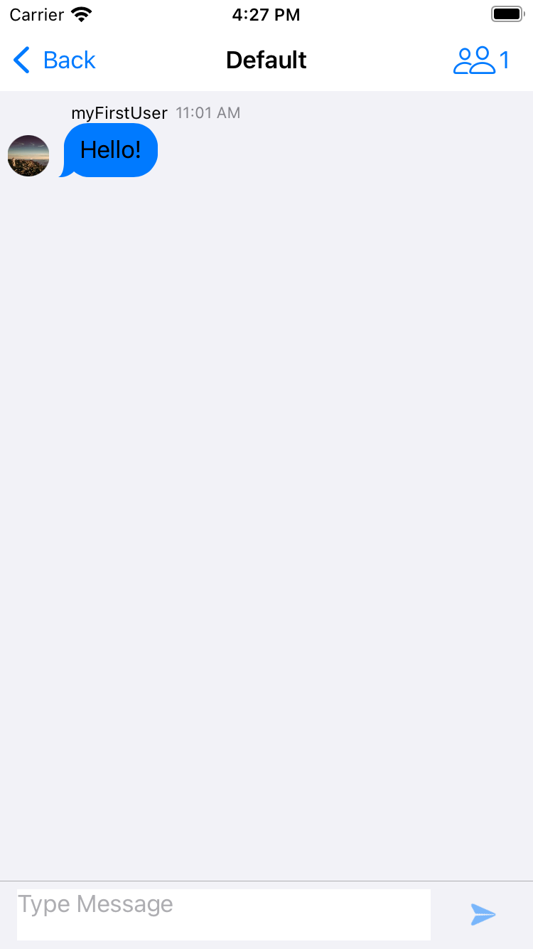
ChannelListcomponent is also loaded as the previousView Controllerin the app's navigation hierarchy. This is visualized by theBackbutton inside the navigation bar of theMessageListcomponent that you will see once the app is up and running.
Run the chat app
Choose a simulator and run the getting-started app.
Send your first message
When your application opens up, type and send your first message. The messages will pile up on the screen as you send them.
To verify that the app is connected to the PubNub Network, mock a real-live chat conversation with myFirstUser. Open the app in a new simulator, send a message from one simulator and reply to it from another.