Themes for PubNub Chat Components for React Native
UI customization is an important part of every component library. PubNub Chat Components for React Native offer many customization options depending on what kind of changes need to be applied in order to achieve required results.
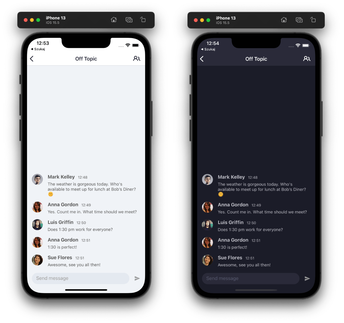
The most basic method of customizing a component is switching between built-in themes. PubNub Chat Components for React Native offer light and dark modes for the most common chat use case.
These are the supported themes:
light(default)dark
To change the default component's theme, change an appropriate option in the Chat provider:
const MyCommponent = () => {
  return <Chat theme="dark">{/* Add components here */}</Chat>;
};
Here is a screenshot showing MessageList and MessageInput default styling for both light and dark modes.